Operations
Heat Maps for Catering: How to Choose Your Next Delivery Zone
Most catering operators expand delivery zones based on a customer request, a gut feeling, or a competitor's footprint. The data was always there to do it better, but reading it required a data analyst.
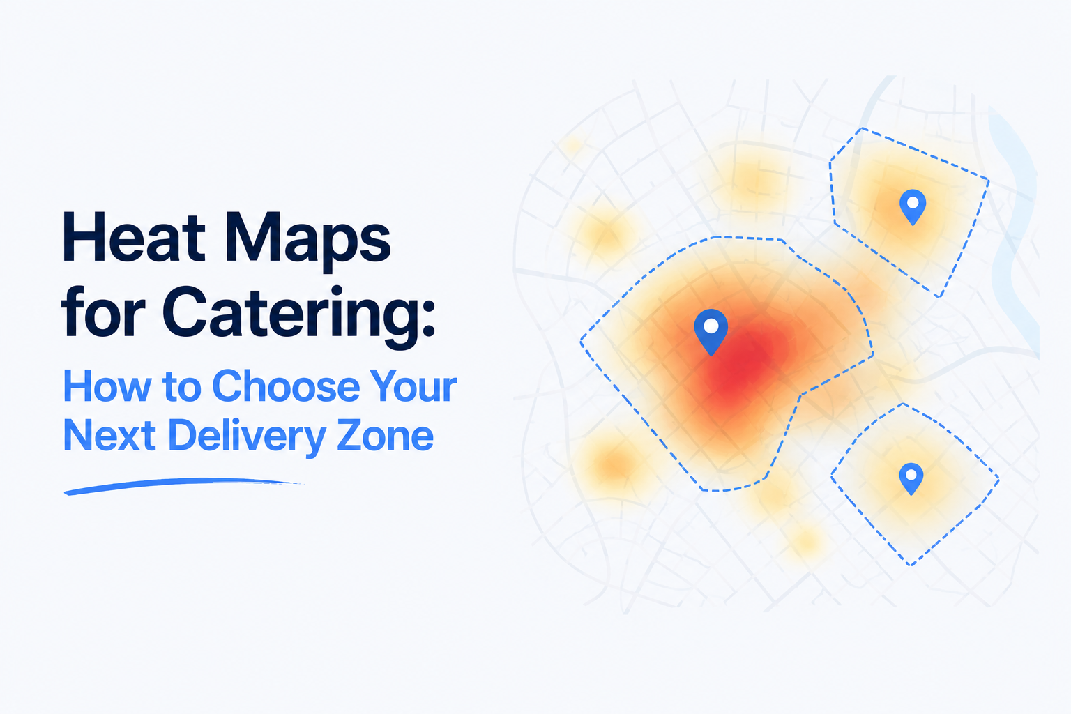
That changed with AI-driven mapping. A heat map plots every order you have shipped onto a map of your coverage area, color-coded by density. You see at a glance where your real customers are, which neighborhoods are underserved, and which areas you can probably skip.
This post walks through what a catering heat map shows, how to read it, and the three lenses that turn it from a poster into a decision tool.
What is a catering heat map and what does it show?
The basic heat map is a satellite view of your delivery area with order density overlaid as color. Bright red is high concentration. Cool blue is low. Gaps with no color are areas where you have never delivered.
It sounds basic. Most operators have never actually seen their own.
The first reaction when an operator sees their heat map for the first time is almost always surprise. "I had no idea Coral Gables was that much of our volume." Or "I had no idea we have never shipped to Wynwood."
That surprise is the data telling you where your real coverage is, versus where you thought it was.
How do you read it correctly?
Three rules.
Look at absolute volume first
The brightest red zone is your bread and butter. That neighborhood deserves your best service, your fastest delivery, your most reliable driver. Lose customers there and the whole map shifts.
Look at growth rate next
The absolute brightest zone today might be mature and flat. A medium-yellow zone that is yellow because it doubled in 6 months is your next bright red. Compare time periods (last 90 days vs the 90 before) to find rising zones.
Look at gaps
A blue or empty zone in an obvious commercial district is the opportunity. There are catering buyers there. They are buying from someone else. The question is why.
What decisions should it drive?
Five concrete operational decisions.
1. Where to focus marketing spend
Do not market in zones where you are already dominant. Market in the medium-color zones with growth potential. The marginal dollar returns more.
2. Where to add a delivery driver
Drivers are a capacity constraint. Put the next driver where the heat map shows you are running near capacity in a high-volume zone, not where you have idle capacity.
3. Where to open a satellite kitchen
If one zone is consistently 30 to 45 minutes from your current kitchen, the heat map proves the need for a satellite long before your gut does.
4. Where to drop coverage
A blue zone you have delivered to twice in 18 months is a candidate to drop from your coverage. Doing so tightens your routes for everyone else.
5. Where to partner with a delivery service
For zones that are too far for your fleet but represent real demand, partner with a third party for that zone only. Cartwheel or WeKnock cover this case well.
What three lenses make it useful?
A single heat map is a poster. A heat map with toggleable lenses is a decision tool.
Lens 1: By area
The basic view. Where do your customers live? Color intensity = order density.
Lens 2: By product
Filter to one menu item. Where does that item sell? Useful for seasonal pushes and local specials. Discovery: your top product might dominate one neighborhood and barely sell in another.
Lens 3: By sales channel
Filter to text orders, web orders, WhatsApp orders, or corporate orders. Each channel has a different geographic profile. Discovery: WhatsApp orders often cluster in one zone while web orders are dispersed.
Compare lenses side by side and the insights compound. "Our top product sells almost only in Coral Gables, and almost only through WhatsApp." That sentence is a strategy.
When should you NOT trust the heat map?
Three cases.
Small sample size
Under 200 orders, the heat map is too noisy to read. You will see clusters that are coincidence.
Recent geography changes
If you just expanded your delivery zone last month, the new zone has no data yet. Do not use the heat map to conclude "there is no demand there" until you have 90 days of effort.
Reverse correlation
A bright red zone might be bright because of one large recurring customer, not because of broad demand. Always check the customer count behind the heat, not just the volume.
How AIA does it
AIA's Heat Map is built directly into the CRM with three lens toggles (by area, by product, by sales channel) and time-period comparisons. The data updates live as orders come in. There is a 22-second video on the CRM page showing all three lenses in action.
Key takeaways
- A catering heat map plots every order on a map color-coded by density.
- Read in three passes: absolute volume, growth rate, gaps.
- Use it to decide marketing spend, driver allocation, expansion sites, and coverage drops.
- Three lenses (area, product, channel) make it a strategy tool, not just a poster.
- Distrust it under 200 orders, in recently expanded zones, or when one customer drives the heat.
If you want to see your own catering heat map across all three lenses, walk through AIA CRM or request a demo.